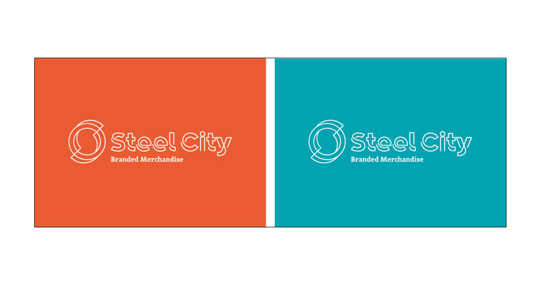
Steel City have recently analysed their brand image to ensure it matches the team’s personalities and passion, the way in which the team interact with clients and suppliers and the company’s 35 years of Sheffield heritage. This has resulted in the forging of a brand new logo, typography and company colour schemes.
With Sheffield being world renowned with a rich history for the production of steel, it was important for Steel City to subtly link this heritage with the company’s own culture and name. The lineal quality and the twists within the logo and typeface is a subtle link to steel being manufactured into parallel bars.
The principle colour of the brand is orange which was chosen to mirror the molten orange shade of when steel is processed. Both the orange and turquoise colourways were also selected to reflect the energy and passion that the team bring to their work.
Another element of the Steel City image that has transformed is the dropping of the word ‘Marketing’ from the branding. “We have found that neither the Acronym ‘SCM’ nor the full wording “Steel City Marketing” are how we refer to ourselves and more importantly, how our clients refer to us. We have been ‘Steel City’ for a great many years and it was high time we reflected this shift in our branding.”
James continues: “Dropping the word “Marketing” from our branding has been a scratch I have wanted to itch for a while now. It is part of the history of the company, but the time is right to reflect exactly what we do, communicate this effectively. We have definitely achieved our genuine identity, one that is clearly understood internally and externally”.
To find out more about Steel City visit: http://www.steel-city.co.uk
Published on: December 2nd, 2015